Author Thread Comments Made During the Challenge
Post actions
nice but not very eyecatching
Post actions
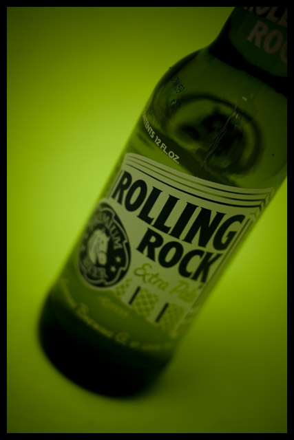
I love this shot for the green tones especially...it just feels good to look at, and in my book that's a winner of an advert. The "message" - the name - is spot on and the DoF is lovely. Really a great way to make a beer bottle appeal and not a water spray or ice cube in sight...classy.
Post actions
The clarity of the label only really plays off the Advertisement theme. I like the green theme too.
Post actions
What is this floating in and why??
Post actions
Nice lighting and comp. Text could be easily placed. Personally, I'd ask for a deeper DOF to highlight the product better.
Post actions
Message edited by author 2008-03-03 18:41:00.
Post actions
Nice green color to accentuate the color of the bottle. Interesting angle.
Post actions
it would be better if the entire bottel was in focus
Post actions
Post actions
The green background is great.





 Add photograph to your favorites
 Add photographer to your favorites


