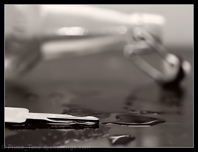
Good idea. Initial reaction was: What is this? Finally figured it out. The bottle in the background is too OOF, and the key in the foreground is blown out and at an angle that it is hard to recognize. The placement of the liquid doesn't have any continuity with the bottle, and seems to be just random puddles. Lighting is good except for the too hot key. Nice effect in B&W. The bottle should be OOF, just not quite so much.
A really really good idea. Because the bottle is such a major aspect of the shot, I feel that it would work better with a deeper DOF. To be honest, I can't even tell what the object is in front of the bottle.
Glad I took the time to see it, and I get it. I like the shot overall but find for an Ad the concept should be apparent immediately. The composition and focus point dont make the very OOF bottle apparent from first sight.
I really had to look at this to get it. An ad should blast its message at me. Especially one as important as this. I think a deeper DOF would've had more impact.
It took me about five min. to figure out what this was. The message was good and the picture would have been great if the bottle wasn't so blurry. Maybe you could back up and just crop it down to this size next time.






 Add photograph to your favorites
 Add photographer to your favorites


 Photographer found comment helpful.


