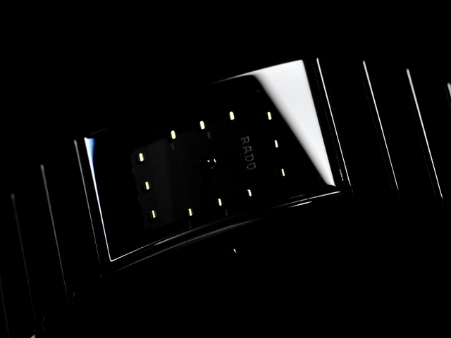
A few weeks ago I walked down an incredibly expensive road in London, all the biggest names in fashion with their shops next to each other. This could have come straight out of one of their windows. Excellent job, the darkness of the shot really works for the product.
The black background runs into the watch making it confusing to look at, if you would have made the background white it could have made the watch stand out better.
I like the "noir" feel to this. The product is right infront of me but I'm not sure, even with the title, if its a watch or a clock. Perhaps more contrast and light on the logo on the face as well a s bit wider crop would help.
It remarkable how well a few lines suggests that there is a watch in this picture. Resizing hurt it a bit, but otherwise very nice...bumping up a couple of points.
A bit more light on the face of the watch would have made it a better shot. As it is right now, you can't tell what make the watch is, sort of defeats the purpose of advertising.






 Add photograph to your favorites
 Add photographer to your favorites

 Photographer found comment helpful.


