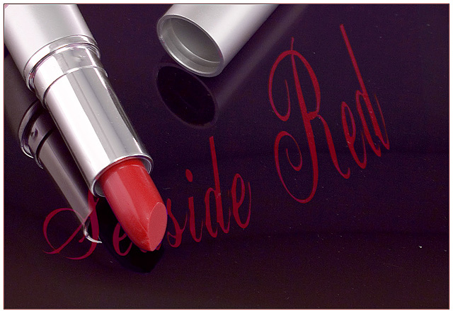
* Large softbox below a piece of glass. Then a piece of black paper with white text, followed by blue gel.
* Levels.
* Hue/Sat layer to shift blues to match red of lipstick.
* Save for web
* Add border & sharpen
* Only noticed the fluff and dust after I had put away the whole set up.
* Title started off as seaside red ... sounds like a good colour to wear at the beach. But suicide red also sounds good. So ...
Guestimated score: 6.00 to 6.30
Statistics
Place: 67 out of 157 Avg (all users): 5.5098 Avg (commenters): 6.6154 Avg (participants): 5.1667 Avg (non-participants): 5.6154 Views since voting: 1233 Views during voting: 401 Votes: 255 Comments: 13 Favorites: 1 (view)
Beautiful ad. Nice negative space for text placement And product is displayed perfectly. My only pick would be a bit more contrast for the lettering. but overall an outstanding job.
I assume this is an actual trademarked product and that is why you've covered it up in the image and title? Well done. Only minor issue is some iso noise visible mostly in the background, but also on the lipstick. Composition is good and lighting is great.
I don't know why you *ed the "eas" but i like your picture reguardless. All the shine in the materials and the handwriting highlights the glamour of the bright red lipstick. Good job!





 Add photograph to your favorites
 Add photographer to your favorites


 Photographer found comment helpful.


