Author Thread
Post actions
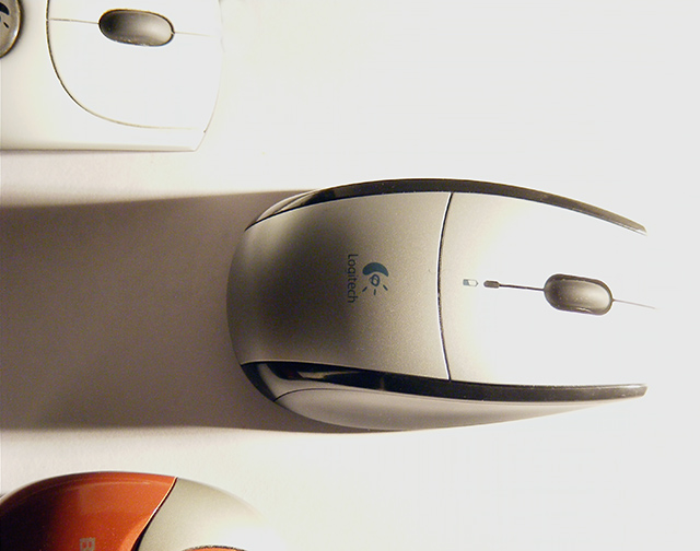
My own preferred mouse. Doesn't have much range though, I have to make sure the receiver stays with about 2 feet. Feels right, though. I bought a second one to use at work, I liked this model so much.
Comments Made During the Challenge
Post actions
The color is a little washed out, and focusing so close on the mouse you sort of lose the idea that it's a race. Maybe a finish line and less bright lighting (maybe diffuse it?) would have made your message more readily apparent.
Post actions
What a great concept. On my monitor, the whites seem a little blown out. Other than that, great shot!
Post actions
The right side of the photo is wahsed out. By using a darker color background and getting farther away from your subject you can eliminate that.
Post actions
there is too much light by the mouse in the center of the photo you could have blocked it to make the mouse more visible
Post actions
I like the concept for this photo, it definitely conveys the message. The light source also leads the eye to the main mouse.
Post actions
Post actions
Clever composition, but I feel like the lighting is a little too harsh.
Post actions
Nice concept. Would like it better with just a little more top light so the Logitech name is not in shadow.
Post actions
Nice way to use the lighting to give a motion effect. I don't know if I like the highlight effect but it seems like it was intentional. I'm sure what your selling and the comp is extraordinary.
Post actions
Post actions
Post actions
Good idea for the ad... but the logo should be better lit, IMHO, to make sure the buyer sees which one is the leader.
Post actions
This picture is creative, but the lighint is a bit harsh.
Post actions
The shadow is distracting, portions are burned out. This needs more definition.
Post actions
Post actions
A little too burnt for my liking but i can see where you were going with it.
Post actions
Post actions





 Add photograph to your favorites
 Add photographer to your favorites


 Photographer found comment helpful.


