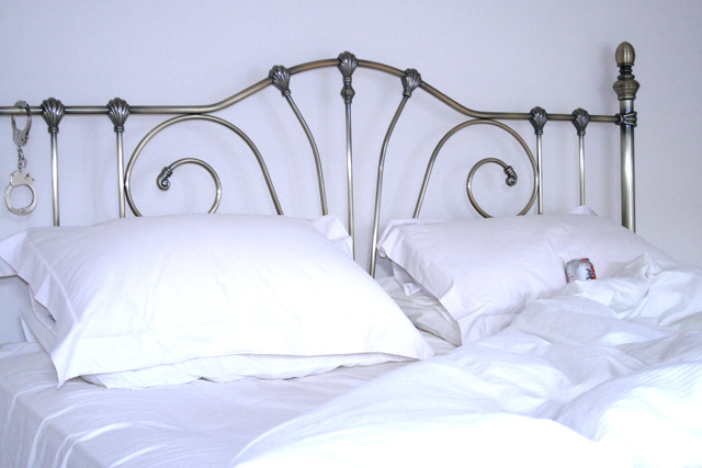
Shot with my standard 18-55 lens and a diffused flash. Once I got the composition I liked I experimented with quite a few exposure levels to get the right 'homeliness' in the textures of the bedclothes. The cuffs came as a late addition and I'm hoping that you see them in the second pass of the eye.
I'm really pleased with the way the positioning of the can implies a turned head, and how what little you can see of the logo is enough. Now that's a strong brand!
Statistics
Place: 132 out of 157 Avg (all users): 4.5182 Avg (commenters): 3.8667 Avg (participants): 4.2903 Avg (non-participants): 4.5946 Views since voting: 1110 Views during voting: 389 Votes: 247 Comments: 16 Favorites: 0
Cute concept, but too hard to identify the can. I looked at the photo for almost 5 seconds before I saw it. Also the sheets and pillow case seem a little blown out.
Ha! Funny. Took me a bit to even see the can in the photo though. As an advertisement, it really needs to be immediately noticable. The composition is nice, if a little uninteresting. The lighting is ok, though the bottom sheets look pretty blown out.
4






 Add photograph to your favorites
 Add photographer to your favorites


