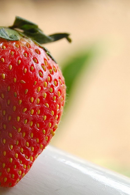
I like the deatil of the strawberry, and I would like to see a little bit more of it. It also has a lot of shadows and highlights that are good but I feel they are in the wrong place.
This ad has a nice comp that lends well to text placement. DOF really helps the comp too. My only pick is that the main product seems a bit dry. Perhaps you could've sprayed it with water or adjusted the red in PP to make it appear deeper.






 Add photograph to your favorites
 Add photographer to your favorites


