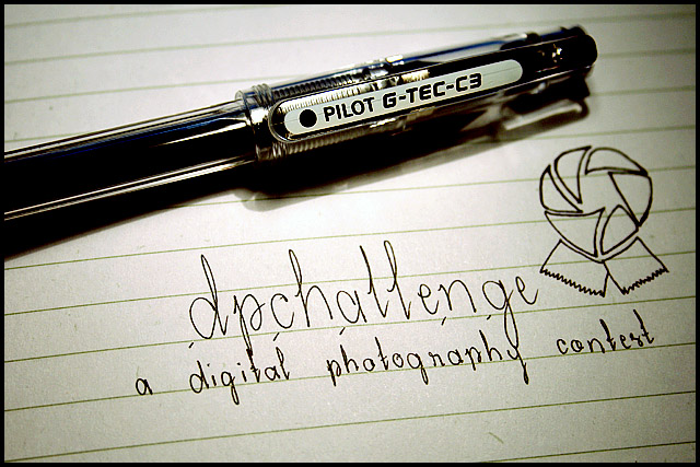
I don't like this because while the lighting is good, as is the composition, the writing throws me off. I feel like it should be a company slogan, not a thing for the photo contest. but that's just me
Nice idea and composition. The front of the pen is a little too dark, might look better with a soft front light to get rid of the deep shadows caused by the pen.
Not bad. I'm sure what the product is and you've shown the comp lends itself well to text placement. LIghting seems a bit harsh and perhaps a light tent or fill flash could dispell the distracting shadows.






 Add photograph to your favorites
 Add photographer to your favorites


 Photographer found comment helpful.


