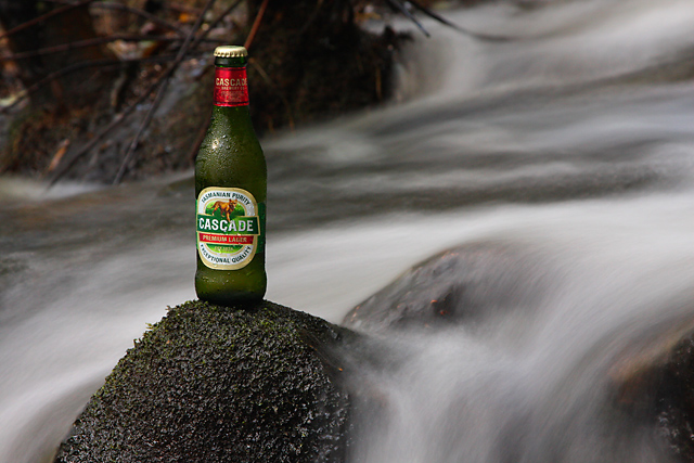
Good staging and shot. Nice exposure, DOF. My only thought is that most advertising would want the smaller text on the label to be more readable- as it is a big part of their product. Still will get a good score from me. Nice shot
A good idea done well and appropriate for the product, but were it in a magazine, you'd want the bottle bigger to be able to more clearly read the label.
very similar images have been on the podium in two previous advertisement challenges, so i dont know whether i can vote for this image purely based on its quality (which i consider is good btw). hence, i will just praise this shot here but will not vote :)
I like this. I think you could crop this tighter to put more emphasis on the product. But your set up really gives a "refreshing" feel to it. Excellent work





 Add photograph to your favorites
 Add photographer to your favorites


 Photographer found comment helpful.


