Author Thread
Post actions
Originally posted by Dr.Confuser:
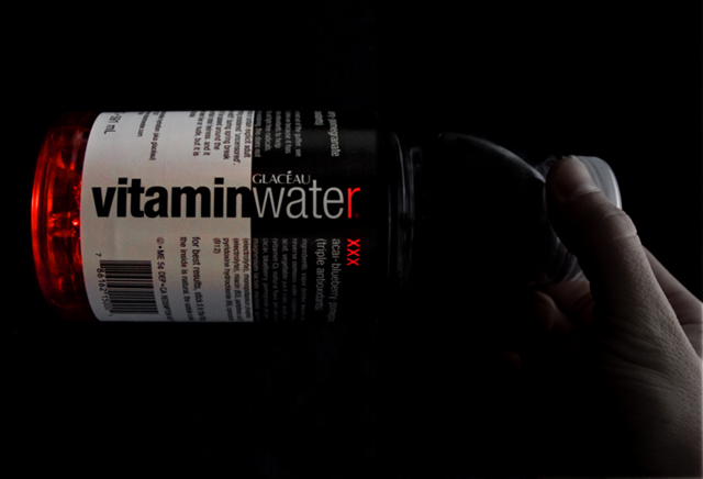
On my calibrated monitor, this is a bit dark. I lose most of the right 1/3 of the photo.
Message edited by author 2008-05-11 12:09:07.
Comments Made During the Challenge
Post actions
Nice work on the bottle details. I think perhaps the hand is a little too subdued, but that's really being picky of me.
Post actions
The black background makes the bottle more important in this photo
Post actions
The editing could be better, maybe a darker red or maybe no editing at all. Cool picture though
Post actions
Try removing your hand from the picture, and it may look better.
Post actions
Post actions
Alot of potential here due to the comp and perfect technical aspects of this. Alot of nice negative space lets text flow right in without ruining the balance. Nice.
Post actions
I like the way the red shows up but the whole thing is a little too dark for my taste
Post actions
A little too dark for my taste
Post actions
I really like your idea, but it seems just a bit on the darker side. Nice composition however.
Post actions
A little dark but nice use of selective coloring.
Post actions
Post actions
Post actions
thats delicious water. nice accent on the r and xxx
Post actions
Post actions
That's an intristing way to show vitaminwater, but isn't it a tad dark??? but it's cool how the read part is glowing
Post actions
Post actions
On my calibrated monitor, this is a bit dark. I lose most of the right 1/3 of the photo.





 Add photograph to your favorites
 Add photographer to your favorites


