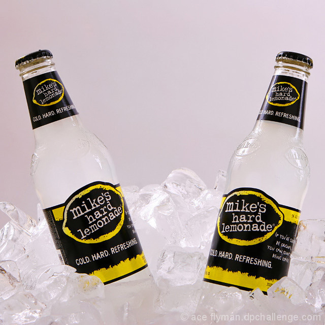
Great work. Ice gives the ad a "cold" feel to it. Product is well presented and the photo is perfectly sharp. Tones add to the visual fell and the comp is excellent for text placement in the future. I really like the symmetrical aspect of this too. 10
A nice idea - the only issue is that with the bottles both pointing out towards the top corners the visual centre of the picture actually has nothing in it . .
Maybe if you had perched a Lemon on top of the ice right in the middle it would have picked up both on the colour of the lables visually, and the theme of lemonade ? I would also ideally have liked to see the background whiter. On my screen this backdrop is just not crisp and white.





 Add photograph to your favorites
 Add photographer to your favorites


 Photographer found comment helpful.


