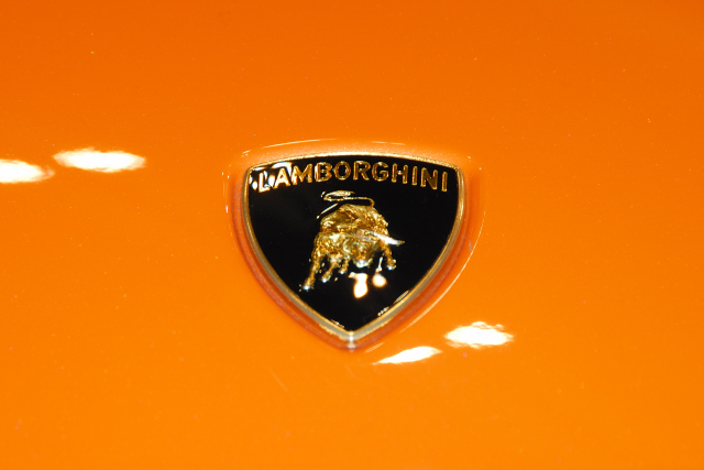
I'd like to thank everyone for their comments. I took this shot at a car show. Unfortunately, I was unable to get close enough to shoot straight down on the hood. So, while it might not look like it from the photo, there is a fairly large distance difference between the top of the logo and the bottom. I didn't want to use a flash, which would have changed the color. I couldn't use a tripod. So all these things worked to make for a very narrow depth of field. You can't tell from this reduced photo, but looking at the original, the specs of dust right above the R in Lambroghini are in sharp focus but the bull is not. I should have manually focused on a spot between the lettering and the bull and maybe the results would have been more acceptable. I would have liked to have gotten rid of the reflections, which were from the overhead illumination at the convention center. But to do that would have required more than basic editing.
And if anyone is interested in seeing a lot of pictures of the Philly car show, they're here:
Philadelphia Auto Show 2008 But please, don't be too critical. I was mostly in "snapshot" mode, not creative mode. There are a some shots I really do like that I think could stand up to a critique. But most are just eh.
Thanks again and hopefully I'll do better next time.
These shots can be surprisingly hard to do well, and I think that with a couple of tweaks this could have been much stronger.
The first one is that the focus is not quite perfect - and for thsi sort of simple shot it needs to be absolutely spot on. This may mean a tripod, or may just mean altering ISO to get a high enough speed to steady it.
Secondly, I wonder if it is too central ? I think the reflections of the lights might actually be able to be built into the picture, so that they appear to be almost like clouds with the Lamborghini badge almost being like a hot air balloon floating among them. Perhaps if the badge was brought down closer to the bottom right of the picture, rather than being right in the centre ?
catching a logo in focus sometimes, especially when it is in gold, can be very challenging, and this was a great attempt, but the logo is just not sharp enough. Also, to not get the sweet details of a lamborghini in one of their shots may be sinful!
Perhaps a bit more 'straight on' shot (from up higher and forward) would make this more readable... Getting rid of the light reflections, especially on the logo itself would be a plus, in my opinion.






 Add photograph to your favorites
 Add photographer to your favorites


 Photographer found comment helpful.


