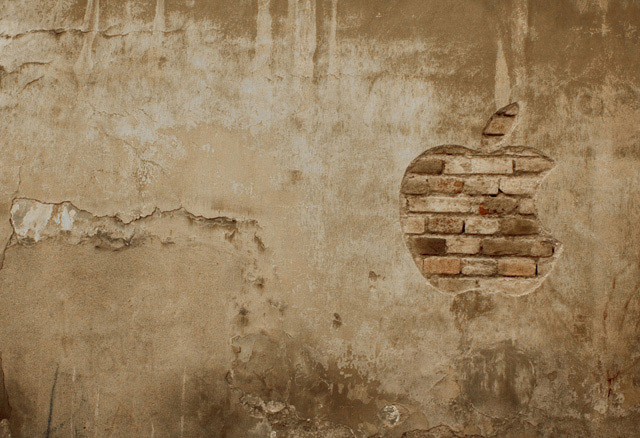
So I was just browsing these streets. They're old and wet and walls are so used they might fell apart each moment. At some point something stared at me, coming as a surprise. A designed wall, just like mac does to every product they have, an iWall... giving life to not only a wall but whole street.
Statistics
Place: 6 out of 157 Avg (all users): 6.6705 Avg (commenters): 7.5769 Avg (participants): 6.3968 Avg (non-participants): 6.7576 Views since voting: 4170 Views during voting: 443 Votes: 261 Comments: 36 Favorites: 3 (view)
i might understand fives and sixes for this shot but cannot understand the ones and twos for this photo. maybe not everybody appreciated the minimalism
Well, this apple is carved in a wall and upper layer is removed so you can see the bricks. Due to the fact that the wall is old some of the bricks have different color. then just made the shot when light was good in my opinion and also I imagined that shooting the apple on right with the cracks in the wall in left would have a bigger impact. After the shot, besides usual contrast and light adjustment I desaturated yellow.
Thanks for voting this.
One of my favourites. Fits very well with Apple's 'minimalism'. A very different shot, but I love that! Logo is chipped away perfectly. I maybe would have gone with just 'iWall' for the title, but hey- this shot is excellent! Hopefully you'll score high!
I really like what you were after here - I'm just not sure whether it quite works (for me).
I like the shape carved in the plaster, and the mix of a symbol that epitomises stylish minimillism, set into a air of grunge and decay, causing a good dynamic tension. I wonder if you have desaturated this though ?
I think I would have rather seen the plaster whiter (almost stuccoed) and the brick redder . . but that might just be me :- )
Great shot, but I question this very strongly for basic editing. The tones and textures are great, and its very simple. I love the shot, and will score it nicely, but THINK that there is probably to much editing






 Add photograph to your favorites
 Add photographer to your favorites


 Photographer found comment helpful.


