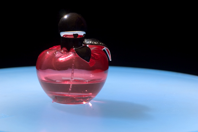
I like the divided background. Nice comp allows for text and product is well displated. I think this needs a levels adjustment to really make the product pop out at me.
Not enough contrast between the black stopper and the background. At first I couldn't tell there was a stopper there and just saw the highlight floating in space above the bottle.





 Add photograph to your favorites
 Add photographer to your favorites


 Photographer found comment helpful.


