Author Thread Comments Made During the Challenge
Post actions
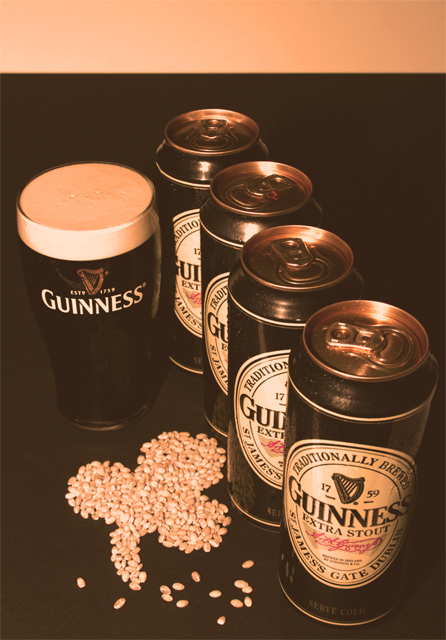
Nice presentation. I like the POV. Beer looks appetizing and I like the clover shape. My only pick is the darkness of the background doesn't give enough contrast. A little more negative space on top would allow for more balanced text placement.
Post actions
Love the concept, needs more contrast to get rid of the "fog"
Post actions
Post actions
The WB looks off and the lighting is a little weak.
Post actions
Nice set-up, good composition. Leads right to the glass. The contrast is a little dull, and maybe the band at the top could have been cropped out.
Post actions
Good idea, your white balance is way off though.
Post actions
Nice compostion and concept. The color treatment doesn't work for me though, find it distracting.
Post actions
lighting is a little too warm
Post actions
I love everything about it
Post actions
Post actions
This needs back lighting to wake up the glass. The beer should stand out, see the bubbles in it, and condensation on the outside. Keep only one open can in the shot.
Post actions
Good idea with the setup... perhaps a bit brighter would be better to give a more realistic coloring of the labels.
Post actions
I like how the overall tone is "Guinness" colored.
Post actions
Nice layout. Interesting "old" look with the sepia tone.
Post actions
Post actions
What is it with this site and beer? Try an original idea.
Post actions
nice photo. i like how you use barley for the clover.
Post actions
The color cast takes away from this. The white balance is way off.
Post actions
Post actions
nice idea with the clover leaf. white background distracts a bit. toning doesn't work for me, had preferred pure b/w or a darker tone





 Add photograph to your favorites
 Add photographer to your favorites


 Photographer found comment helpful.


