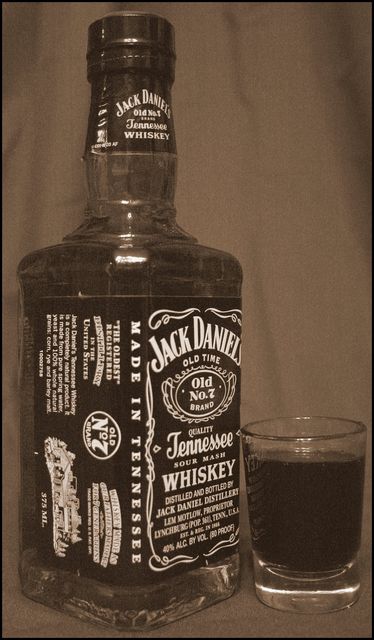
The color treatment doesn't really work for me. The background is too drab and close to the color of the bottle. Also don't like the wrinkles in the backdrop.
Nice old feel to this ad. Nice comp and the product is placed prominantly within the ad. However, the bottle should be face on instead of the angle you've used.
A bit dull overall, needs some sharpness and sparkle, some contrasts. Bottle should be open, glass needs some ice or something to make it look like an inviting drink. Drink some of that Jack, and keep working on it!





 Add photograph to your favorites
 Add photographer to your favorites


 Photographer found comment helpful.


