Greetings from the Critique Club!
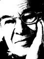
Composition - I like the originality of the 'letterbox' form because it gives spacing for the direction he is looking. Whatever is in the background is distracting, but also gives his face a little bit of an emphasis. Maybe if it had been a solid color or less descript it would have been less distacting
Technical - I don't really like the amount of noise/grainyness in this photo. I think the lighting could have been more even (his chin fades into his shirt yet his hand glares). I like the contrast that the black shirt makes. Seems like it could be slightly more in focus. The color is natural.
Meets the Challenge - Check :)
Creativity - I like how he seems so relaxed, yet alert. How his eyes give interest to whatever is happening. In this sense it is a good portrait.
Good summerizing title, nice border.
Overall - Good portait but a little lacking in the technical aspect. They eyes sum up the shot, they are so full of depth. Keep up the good work.
I really like the expression on the face. I feel like I"m hanging out with this person just by looking at the photo. I love the composition and how you seem to have captured a candid shot. Good luck!
Another letterbox aspect ratio - not sure about that. Interesting horizontal bar of light, emphasising hand and eyes. Think I might have tried to move the checked materail (curtain?) which distracts slightly.
Soft focus and grainy texture that doesn't seem to add to the composition. I like the catchlights but the seem to give away some motion. Was there any movement you had to compensate for or is that just the physical design of the light sources? The skintones are not consistent throughout but that probably has more to do with the uneven lighting that you caught on the face.






 Add photograph to your favorites
 Add photographer to your favorites

 Photographer found comment helpful.


