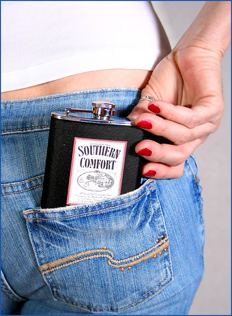
Really happy with how this turned out. Originally planned a shot advertising makeup for this challenge but idea to use this flask I had with liqour label on it came to me in my sleep and I really liked it. So, researched some liquor that might be fit the flask idea and their labels, settling on Southern Comfort for it's shape and simple design. DLed label of net, sharpened it a bit and tweaked contrast slightly before printing it out and cutting it out with an exacto knife. A bit of wax was layers on the back of the label to affix it to the flask. Then all I had to do was get the wife to put on some of her tight, fancy jeans and a white top. Lighting was a softbox (full power) about 45 degrees from right with bare SB-25 (1/16 power) for fill from left. PP = Rotated, slight crop, very minor tweaking to levels, brightness, contrast, saturation followed by resizing and sharpening.
Statistics
Place: 33 out of 157 Avg (all users): 6.0122 Avg (commenters): 7.2727 Avg (participants): 5.7797 Avg (non-participants): 6.0856 Views since voting: 1885 Views during voting: 448 Votes: 246 Comments: 11 Favorites: 0
Clever title and original idea. Comp is great and draws the viewer through the ad. A filter or a stop down or two would kill the distracting blown highlights on the shirt. Still, very nice work.





 Add photograph to your favorites
 Add photographer to your favorites


 Photographer found comment helpful.


