Author Thread
Post actions
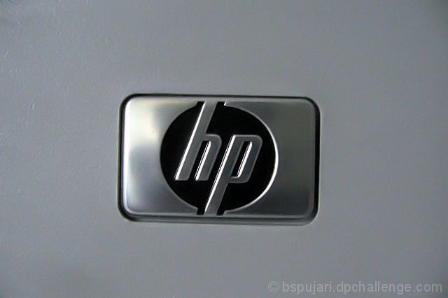
A simple idea, and its gives a soft, but also a strong impact to the viewer. Simplicity at it best.
Post actions
you could have at least straightened it... good try!
Comments Made During the Challenge
Post actions
I like these "less is more" approach ads. However,when you go for this everything has to be "tack" sharp. Logo seems a bit tilted too.
Post actions
the camera angle is straight on, if you had an interesting angle it could have made the shot better
Post actions
Post actions
Doesn't look sharp. Did you want fuzzy?
Post actions
Post actions
Post actions
Post actions
This is a good picture but it is a little off center and crooked.
Post actions
right side is a bit too dark for me. Great concept, and I like the crop & composition a lot.
Post actions
This could be straightened to be level and be much better. OR it could be even more tilted... but if you're going to break a rule, then bust it wide open or it seems like an accident. :)
Post actions
Sorry, but this doesn't do much for me. The lighting is too harsh on the left side of the emblum, and I think I can even see you in the reflection. It might be just me, but the subject doesn't look completely straight.
Post actions
Doesn't say anything about the product.
Post actions
Watch out for the slight right tilt.
Post actions
I like minimalist shots. But minimalism only works if they are perfect. And this one is slightly unlevel. Would be unnoticable in a 'normal' shot, but very disturbing in this one.
Post actions
Sometimes simple has impact but not this time I'm afraid. Certainly the slight angle helps.
Post actions
Yes, HP but isn't it kinda plain
Post actions
Post actions
not quite straight in frame detracts, either straight or more of an angle





 Add photograph to your favorites
 Add photographer to your favorites

 Photographer found comment helpful.


