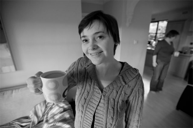
I quite like this shot - but you have a real 'fisheye' thing going on here with your verticals all over the place.
You either need to lose the effect, or embrace it with a title that acknowledges the issue and uses it to bring the viewer more into the shot, so maybe something like 'Tea - Helps straighten things out'
This is one of those ads that I can't really tell what the product is. The background is a bit distracting too. I'd use a tighter crop and maybe include the tag from the tea bag to present the product better.
doesnt focus on the tea nor compel me to get up & get a cup...the person in the bg is distracting; I think a much tighter crop would have helped to "sell" this image
Just doesnt seem like much of an advertising shot to me... Lighting on the model is deent, though some of the photo seems a little muddy. The second person in the background is just a little distracting as well.
I like the feel of this... I wish the lighting on her face were a bit better to give us a clear subject to focus on before exploring the rest of the scene.





 Add photograph to your favorites
 Add photographer to your favorites


 Photographer found comment helpful.


