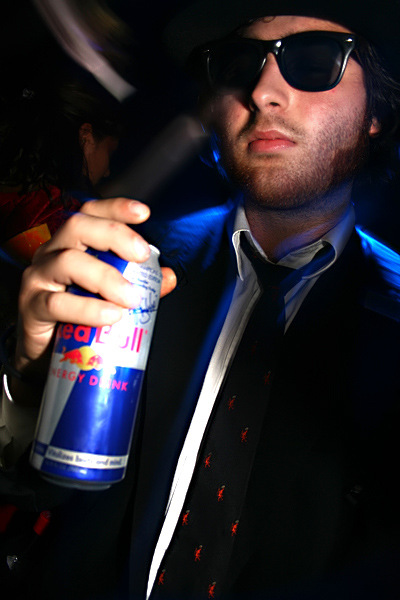
The product is out of focus! While I really like the lighting and the idea is pretty cool, the product being out of focus is a real no-no, at least as far as I know
Not a bad start. Product is well displayed but there's too much glare. remember, its all about what you're selling so the can of red bull needs to be perfectly presented.. Background is a bit busy too.
I find the background and the glare on the can to be quite distracting. When advertising a product, at a minimum, you want to be able to read the name of the product nice and clear. Good idea though.
I like the brightness of the colors used and the photo itself the the red bull can has a very large glare on it which defeats the purpose of advertisement.
Good concept and nice lighting, except a little washed out on the front of the can. It also seems a bit out of focus - it'd be better to keep the can in clear focus and the guy less focused. I'd also prefer to see the guy holding the can at the bottom to see the entire name of the product.







 Add photograph to your favorites
 Add photographer to your favorites


