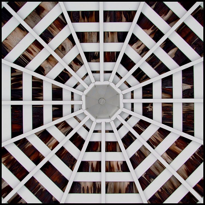
An outake from the Architecture Challenge. I really liked it, but wasn't sure if it was "really" architecture.
This was harder to take than it looks, lol. I had to lie down w/ my head almost exactly in the center of the gazebo - so that the lens was centered. And then I had to crop a bit more carefully than I thought - due to the fact that it was not "perfect."
Then I played w/ the curves in a similar way to the tutorial on HDR in Basic.
Statistics
Place: 192 out of 428 Avg (all users): 5.6434 Avg (commenters): 4.5000 Avg (participants): 5.6061 Avg (non-participants): 5.7273 Views since voting: 957 Views during voting: 213 Votes: 143 Comments: 12 Favorites: 0
The texture of the wood really pops out and contrasts well with the white. And it's a strong geometric shape..
It's a simple picture and that's its strength and weakness.. This was limited scorewise definitely because of the competition typical for free studies ..
Good textures and geometry. Not sure how you could improve it... I also agree that it would very likely do better in a more specific challenge. It just doesn't jump out at you in a free study.
This is not the kind of shot I can scroll up and down to see if I like a different crop! It's making me dizzy even when it's not moving ::yikes:: I think it's the wood pattern radiating behind the white woodwork. It's really quite fascinating to look at.
Don't know why it didn't do better; maybe you just made it look too easy to get!
Really just one of those underappreciated shots, nothing really "wrong" with it. Very strong geometrics and shot in a way that it appears to be rushing at you; plus I like that funky looking wood behind the framing, really adds interest.
There is really not much to nit on this shot IMO. I might have tried to play a little with shadow/highlights and get a touch more detail in the wood behind the gazeebo top (guessing that is what it is). It looks a touch flat due to the lighting in the shade This is such a great abstract shot, but I'm finding that abstract is not for the mainstream here, thus doesn't score well in Free Study challenges. (Personlly, I like them very much!) If someone were to get totally picky about this, the shot is every so slightly (minutely) not centered. I think the shot is fun!!
Dazzling image processed to perfection. I suspect this would have scored very much higher in a patterns/symmetry challenge but fares less well in a free study. If it's any consolation I don't think you could have done this any better.






 Add photograph to your favorites
 Add photographer to your favorites

 Photographer found comment helpful.


