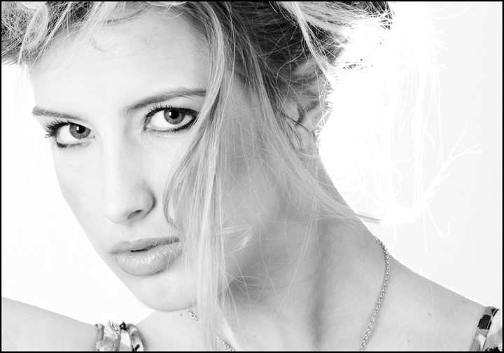
I really like this shot and gave it an 8 during voting. The stare works so well and I don't mind the blown out hair at all. I actually do prefer the original color version and would have probably given it a 9 though. I love dramatic lights comeing from odd locations as your seperation light is...just suites my taste I guess. I really am shocked this didn't score at least a 6....strange!
IMO this shot doesn't benefit at all from the B&W conversion, as the nature of the lighting is pretty flat - not a criticism as it works perfectly well in the colour version. The blown out hair is also much more incongruous in the B&W context. On a personal level I don't get particularly excited by photos of model-like women, no matter how beautiful, if I don't feel any kind of emotional connection with the subject. Her expression here doesn't speak to me, but this is obviously incredibly subjective. That's my two cents anyway! :)
I meant that the effect from my lighting is not as prominent when I convert to B&W...and the white background further reduces the effect the lighting has on the image. If the background were black...we would have a slightly different conversation...and the highlights would be even more distracting.
People seemed to have liked this image -- the majority of the votes are six and above, and nobody trashed it with a one or two. I think it is just the distracting blown highlights on the right that prevented a really high score. The model is beautiful and you did a great job of capturing that beauty.
You said the hair on the right was lost in the b&w conversion. I'm wondering what method you used for the conversion, and I'm wondering if you could use two different layers with different parameters for the b&w conversion. Then use masks to bring back the blown hair.
I like this shot very much and feel it should have scored a higher score. You've got the info about the blow out....would have been nice to see the color version. When you do another version you might try and move her to the right, alittle more towards the center. You've done a really good job controling the lighting and keeping her face soft....all in all, I think it's a great shot. Keep up the good work. She photographs well....would like to see more of her in the future. Best of luck. X
Thanks for the comments so far. I am beginning to understand why this image did not do as well as I was expecting. The blown highlight was actually intentional...although not necessarily for this specific image. I had set up a strobe behind Sarah to highlight the hair, which was being blown around by a fan. This gives a VERY cool effect. However, the effect is mostly lost when I convert to B&W or crop heavily. This image did both, so the effect was lost and actuallly became a distraction.
I plan on making another version with the entire right side cropped out to get rid of the blown highlight. It will be a different compostion, but the eyes should still make for a decent image.
Any other comments?
PS - I will be posting some more images from this shoot for everyone to look at and comment on. Hopefully tonight...
The pose and framing is attractive - nice lock-you-in gaze - but the blown hair on the right is noticeable enough to be distracting, to me. I don't know how you lit it or whether you had control over the lighting, but the light on that side might have been better off minimized somewhat.
She is stunning.... the only conflict i have is that the blown out highlights suggests bridal to me, while the shoulder straps suggest otherwise. Still a nice portrait though.
Sarah is very lovely! Excellent pose, composition. There's "blown out hair" on the right, that I think is probably semi-erased? I can see it on this monitor pretty clearly, but not so much on my brigher one. (Commenting only, no vote.)





 Add photograph to your favorites
 Add photographer to your favorites

 Photographer found comment helpful.