EDIT: I just wanted to add that I think the juxtaposition of the beautiful colors (and the dreadful colors of bruises as the title suggests to me) is expertly done.
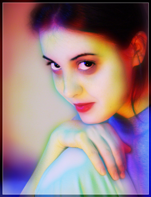
I really like this. I would like it even more if the colors were not so intense. I think the intense color around her face slightly distract from her beauty. Overall, I like the composition.
This is a very interesting shot, a different take on the usual studio type look and that can work both to your advantage and against it. I personally liked this shot for the composition and the expression and cropping. The post processing left me just a little off though. I think it's the coloration around her eyes, almost gives her a zombie look, if that was a little softer I think this shot would really stand out. Also the cropping on the right seems just a tad tight, a bit too close to the back of the ear, maybe just a touch more hair to be seen?
I would love to see this shot before the processing to see if the coloration around her eyes is from makeup perhaps? Other than that, a wonderful shot.
I see you are in Romania, my Sister-In-Law is from there, not sure exactly where but I know she and my brother plan on traveling over there this summer.
Good Luck In Future Challenges!
Deannda
DNeufer@stny.rr.com if you have any questions or want to discuss this further!
Thank you all, I do feel like a winner because of your comments. I guess it's a bit different and that scares some people. That's ok, in my opinion a good shot must be really loved or really hated. Because many of you asked, I will post a thread in the forums about how I did it, probably many of you will be surprised of how little and simple editing this suffered. Without a bit of spot editing I did for the mouth and eyes, it would be good for basic editing too, only curves and a bit of gaussian blur. Only took me like 15 minutes. I will post all these in the forums later today, again thanks alot for all your comments weather you like it or hate it.
This shot got robbed. It was the best portrait of the week - definitely in the top 3. I was sad when I saw it because I knew "crap, mine isn't the best pic of the week!" (Though maybe senimentally the second best. ;)
This was a phenomenal shot and is going on my faves list.
The colors and soft tones make this look like a painting or pencil drawing. Hopefully you listed your post processing steps, I'm curious to see how this was done. Great portrait composition. I wish this looked more like a 'photograph'.
i love this...the colors are wonderful. i'm anxious to see how you achieved this since i'm assuming your model didn't wear multi-colored make-up and this was done with post processing. the soft focus blends everything well and gives the image an iridescent quality. nice work!
I don't know it you've used a filter on this or created the effect through the lighting set up. Either way the combination is awesome and it works for me (9).
This is very interesting. almost looks like it was done under black light. I really like the colors and pose. The only thing that is distracting, is the color under her eyes. they make her appear like a heroin addict. Very tired and worn out.
although this does't fit my tastes, I have to say that it is very well done...the colors all go together nicely...technically the only thing I can see that I don't like is in her top it looks like maybe too much saturation on the blue...but her eyes sell this shot - they are fantastic...
Thought there were some very unique presentations in this challenge of some ordinary poses. . . until this opened. Very, very, attractive. I am certain I'm looking at the Blue Ribbon portrait. Impressive. Electrifying. Brilliant. Soft. Mesmerizing. Seductive. BOL
I keep coming back to this..I really hope there are notes as to how it was done. So captivating and full of tone. Great crop and sharpness in the eyes. thank you!
composition and expression are great. I am all for different approaches to color, but the color under the eyes just doesnt do it for me. Would love to see this with a different color combination.
Interesting acid colors saturations. As the model is pretty, and the shot quite conventional, this could be well in B/W or sepia too. Good to try something else.
8.
i'll bet she's very pretty, but the photoshop work makes her look a little scary. i'm drawn immediately to the dark patches under her eyes. i think i'd like this a lot betterif the colors were a little more muted
I don't usually like heavily photoshopped images, but this one has a wonderful magical quality to it. It is a wonderful image to begin with, and your colorful rendition is very fun and appealing. Don't be discouraged if you get lower votes from the 'purists'... This is a real treasure!
JD






 Add photograph to your favorites
 Add photographer to your favorites

 Photographer found comment helpful.


