| Author | Thread |
Comments Made During the Challenge  |
|
|
02/11/2008 03:10:26 PM |
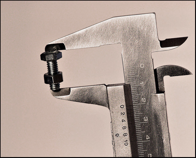
i quite like this - the only slight issue for me is lack of 'Wow' factor.
I wonder whether the background is too similar a colour to the tool ? |
|
 Photographer found comment helpful. Photographer found comment helpful. |
|
|
02/11/2008 03:04:05 AM |
|
| Photographer found comment helpful. |
|
|
02/10/2008 08:06:00 PM |
|
Nice concept but it looks a little flat to me. Perhaps it's the overall color cast. |
|
| Photographer found comment helpful. |
|
|
02/10/2008 11:15:35 AM |
|
Contrast is good. Maybe less of the mic and more of the fastener. |
|
| Photographer found comment helpful. |
|
|
02/09/2008 09:17:04 PM |
|
I like this and not too many have tried this association type of add. By putting the Micrometer you give the feeling of "Precise". Very nice. Product is well displayed and tones add to the feel of thead. Negative space makes text placement easy. I mat of gone wuth a tighter crop and less tilt but yours is very, very nice. |
|
| Photographer found comment helpful. |
|
|
02/06/2008 04:22:04 PM |
|
love the simpleness of it. |
|
| Photographer found comment helpful. |
|
|
02/06/2008 09:24:59 AM |
|
| Photographer found comment helpful. |
Theme:
Classic /
Light /
Dark
Home -
Challenges -
Community -
League -
Photos -
Cameras -
Lenses -
Learn -
Help -
Terms of Use -
Privacy -
Top ^
DPChallenge, and website content and design, Copyright © 2001-2026 Challenging Technologies, LLC.
All digital photo copyrights belong to the photographers and may not be used without permission.
Current Server Time: 10/09/2026 05:56:17 PM EDT.







 Add photograph to your favorites
 Add photographer to your favorites


