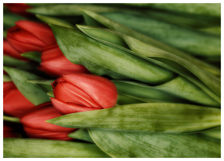
Oh dear. A flower shot. And one that I spent far, far too many hours on trying all sorts of different things, but it was a good learning experience! Had to play with my new lens, though. This was taken at the Saturday market in Wiesbaden - tulips for sale in bundles - they're really very lovely. I probably should have bought some! I'm no Robert Mann, that's for sure. :-)
If anyone is interested in the processing, I will try to reconstruct what was done to this particular version, but no guarantees. This is what it kinda started out as:
Post challenge: OK, so I won't try any more flowers.... :-) (Though I do like the way this turned out.)
Processing: More or less it went something like this...
In RAW, I went to the color tab thingie and desaturated the reds a bit. Opened in PS, adjusted levels slightly. Ran the Dragan action (from ATNCentral) and dragged that layer over the original. Reduced opacity to about 65% and flattened the whole thing so far. Ran the Midnight Sepia action (also from ATNCentral), dragged THAT layer over the flattened image and reduced opacity a little - maybe 85% or so. Then I did a sorta vignette thing. I create a new layer, did an oval gradient of black to transparent with the reverse box checked, then in Edit, I chose Free Transform and I stretched and pulled that gradient layer until I liked where the light and dark sections fell. Soft light layer and reduced opacity. I do believe I may have added a gaussian blur layer after that and erased around the tulip head and the leading leaves.
Statistics
Place: 144 out of 428 Avg (all users): 5.8227 Avg (commenters): 6.2857 Avg (participants): 5.8660 Avg (non-participants): 5.7273 Views since voting: 1072 Views during voting: 212 Votes: 141 Comments: 27 Favorites: 1 (view)
I think this is gorgeous, and your processing really brought out some great stuff in the photo, I think. One thing that may have helped is some dodging&burning / increased contrast on the leaves - just a little. But really, I think this is very nice.
I haven't really gotten serious with layers yet, so a lot of your processing steps went over my head right now.
I really like what you did with it. Even though the tones are more subdued, it brought out the veins in the flowers. The composition may be a little too heavy on the left side, where all the red is. That's the only thing I might fault it with.
I did not vote on this one, but I think I would have given it a 6 or 7.
Hey Deb -- I didn't vote on this one originally, but I do like the colors and soft processing and DOF techniques. The composition is pleasing as well, though a part of me would like to see more of those flowers on the left edge, at least that top one that's lost just the tip of its petal. The colors and tones on the leaves are marvelous. Very lifelike.
This is a response to your request today for comments on this image.
I think it is simply lovely! It conveys very well the beauty of flowers in a bunch waiting to be sold. It is quite a contrast to flowers that have been primped for display. The soft focus seems just right.
The composition supports the idea that these are flowers lying in a bunch rather than upright for display. I would have preferred more of the tulips on the left and less of the leaves on the right but I don't feel strongly about this.
I can't believe this didn't break a 6 at least. I remember seeing this in voting and thinking it was Ursula's. It is quite beautiful and the processing is outstanding!
Oh I am so JEALOUS over your new lens. I have been drooling over that lens wanting it more than life itself lately . . .but. . .sigh. . .we are getting new flooring/cabinets/countertops, so I'm afraid the new lens (and the 5D I also want) is going to have to wait a while. I love your take on these tulips. Such an interesting composition rather than standing up leaning over like you usually see them. Very creative and well done!
I like the softness you got here. The non-standard composition - lordy, you even have them going right to left! - really makes this a compelling image to look at. One of my 9s.
There is a definite softness here, not in processing, not in "focus" but in feel. It moves me across the image, but always brings me back. It's quite delightful, and I bet would make an awesome print.
A lot of good work has been done in this shot to bring in the different greens against the red, my first thought was wrong profile, portrait my have brought you higher scores.
Well, I personally liked this shot and now that I see your original, I loooooooove the processing. This would look perfect on a card. I love the soft glow and also love that you used PP to enhance the textures. Let me know when you decide to share the processing steps!
There's something about this image that lifts it beyond the ordinary. The frame filling is good and the composition works well. The slightly muted and almost grungy look you've acheived is very effective. Well done :)
Lovely combination of softness and sharpness... that doesn't really make sense, but that's the only way I can think of to describe it! This just has that special something :)
Deb, there is no way these will end up sub-5. You just got some early bad votes. They are really beautiful, actually. I confess I don't like the processing quite as much as Neil's, but close. I think you will end up doing just fine, and if not, poo on the silly voters and make yourself a gorgeous poster!







 Add photograph to your favorites
 Add photographer to your favorites


 Photographer found comment helpful.


