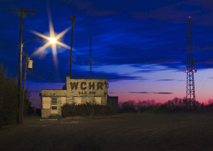
Taken at the old abandoned radio station. I did some editing. I'll post what I did if this does decently well and/or if people want to know.
Post: So, I've seen some comments about the Sepia look of the building vs. the colors of the sunset. To explain, the color of the building was grey. However, because of that light, the whole thing turned bright yellow (see here) I guess while taking out some of that yellow, the building took on a sepia tone, which wasn't exactly my intention (I just wanted to be that crappy yellow). I did consider submitting a black and white version (see here), but decided on the color at the last minute. Thanks for the kind and helpful comments.
Statistics
Place: 225 out of 428 Avg (all users): 5.5282 Avg (commenters): 5.6667 Avg (participants): 5.4949 Avg (non-participants): 5.6047 Views since voting: 968 Views during voting: 208 Votes: 142 Comments: 6 Favorites: 1 (view)
I actually liked this quite a lot and gave it a 7 during voting. It is definately a strange conversion with the combined saturated sky and desaturated foreground. I would have given it higher marks if it had been a good old fashion black and white conversion though (especially if the flat lit foreground was dodged and burned to give some texture).
I didn't think the combination of sepia and strong colors would do well overall, though I liked it's use here. Sometimes you know it will not appeal to the broad spectrum of tastes. This one was an experiment in a way.
Sometimes you just need to throw it against the wall and see if it sticks. (Or is that "Run it up the flagpole and see who salutes"?)
Very nice. Inf act, it's another for my faves list. The sepia seems out of place with the strong colors in the sky, but strangely enough, it works for this.






 Add photograph to your favorites
 Add photographer to your favorites

 Photographer found comment helpful.


