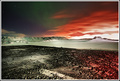
Yep...I gave this an 8 and really expected a top 10 finish for it. The beautiful colours should have done it, let alone the track to infinity at 3rds, mirrored by the sign - or even the textures in the clouds. Voter cluelessness :(
EDIT: p.s. I think it might be the title being too matter of fact. Seems like voters here either like soppy romantic/poetic type stuff or humour. Everything else seems to fall flat...and in this case I really think might have overridden people's sense of taste/appreciation/clue...
This made my top10. 74th? doh! no that doesn't work for me ;)
I thought the sign to be out of place at first sight but then it looked quite quirky and fun. It would be easy to clone that text out and have different versiond of the print available, with your text of choice.
I really like the colours here, and the dramatic sky. Too bad about the sign though, although this is your title, it just seems out of place. 7 from me.






 Add photograph to your favorites
 Add photographer to your favorites

 Photographer found comment helpful.


