First I would like to thank all the people who gave a comment on this pic & to posthumous for the Now as to the title - I really didn't think this picture will get far in the voting but I liked it and so I hoped that some others will like it. the title surly got the attention of people and the picture got 45 comments during voting which was great.
P"s also thanks to DrAchoo for his comment as he is right - the crop should have been a square
Statistics
Place: 95 out of 251 Avg (all users): 5.8381 Avg (commenters): 7.0488 Avg (participants): 5.6500 Avg (non-participants): 6.0091 Views since voting: 1450 Views during voting: 475 Votes: 210 Comments: 50 Favorites: 6 (view)
Congrats on your placement, even more congrats on Don's vision to award the posthumous blue, and I hate to agree with the majority ... but the title probably held you back.
Beautiful!
Almost afraid to vote on it, and possibly spoil your prediction. :) I enjoy looking at this, has a certain poetry to it. The freer form of the bird winging away from the harsh and rigid background - this is very nice. 9
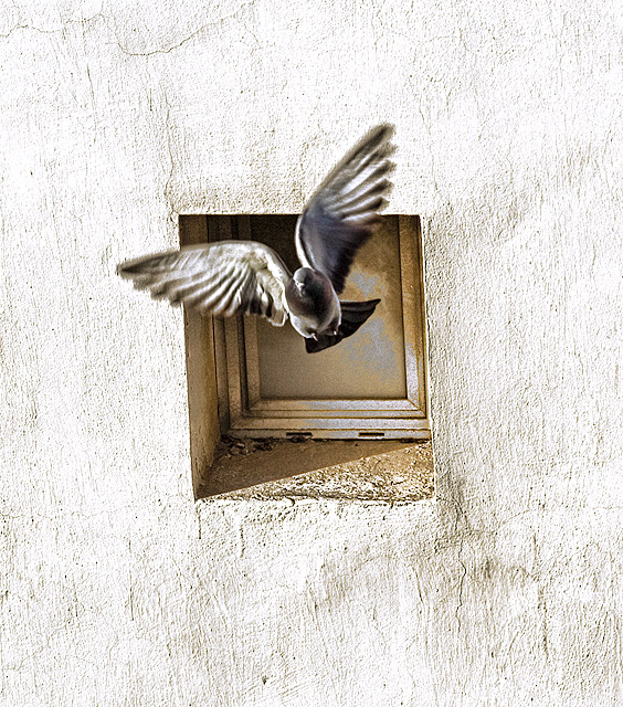
So how is your prediction turning out? This is a very artsy photo, the wall and window act as a frame and the bird is flying out of it, freedom as it were.
ok - votes 202, views 283, Avg Vote 5.02, comments 30 - without your title that may have been the bulk of the comments, but now you've spiced it up ---- my take is you've made a good and unusual image but yes I would like to see a little more detail discernible especially around the head and the angle is a little 'funky', but minor. The grain works well. = 5
You get way more than 4.974, yes the bird is not sharp but this has got mood and atmosphere, I love the toning...my fav so far! Just wondering if it would be better slightly rotated, not sure..9
Nice shot. Interesting composition and perspective. Terrible title and it just kills it for me.
ETA: I apologize for the typo. Corrected now. Not sure how I stumbled back across the comment, but as soon as I saw it I corrected it. Again, I apologize.
Looks like all the focus went onthe window and none on the bird. Sometimes we have to prefocus the anticipated movement. I would rather have seen the bird more sharply and the window soft.
it's visual poem. so far my fave!
(oh yeah and the bird is not sharp. don't want to mess up your prediction, even though i bet you get way more than 9 ;)
It is a good thing I established my vote before I read your title :) Actually I really like this composition, it works perfect centered and simple. I love the wonderful cracks and textures in the wall and the angle of the pigeon. I'll give you a 9, but sure don't like that title.
I could have lived without the title. As a voter I don't like to be told how I'm going to be seeing the photo and voting on it.
That aside - this has a real wow factor. It's beautifully captured and composed. I also like the processing a lot. I'll give it the vote that was my first impulse before I read the stupid title. 8
There are more pigeon pics than I expected in this challenge. This one is in the Top Three of the ones I've seen so far. (This is also one of your nine comments, but I'll bring your average score up...9 ;-)
i know what you mean, but if you love what you enter, the dorks don't bother you as much. this shot and your processing/comp are pretty love-worthy so congratulate yourself on an admirable perversity and enjoy your varied histogram when it's over. but please don't cheat your next masterpiece out of a more inspired title.
Good shot, dopey title. The bird doesn't have to be pin sharp for this shot, and the important part - the head - is in focus. The movement in the wings just adds to the shot by implying movement and flights. The crop/framing is also lovely with the internal symmetry of that window ledge. Great textures on the wall too. Don't be so hard on yourself :)
you asked for it, you'll get it. The fact that the wall IS tack sharp and very bright shows, that you could have easily managed to get the dove sharp, too, by choosing a shorter exposure. besides that, I find the crop too loose and the composition too centered.
Well, aside from the obnoxious title, I like this a lot. I think I would've liked it even more with the bird and opening in one corner and a big white wall filling the frame. But still, getting an 8 from me.





 Add photograph to your favorites
 Add photographer to your favorites


 Photographer found comment helpful.


