Thanks you very much for all comments...
I have nothing to say but the 10th place is good enough for me here.
This challenge is tough, I saw so many beautiful photos when I cast some votes.
Ha - I really like your post in the architecture competition, and when I looked at this the first time I wondered if it was the same guy. Turned out I was right.
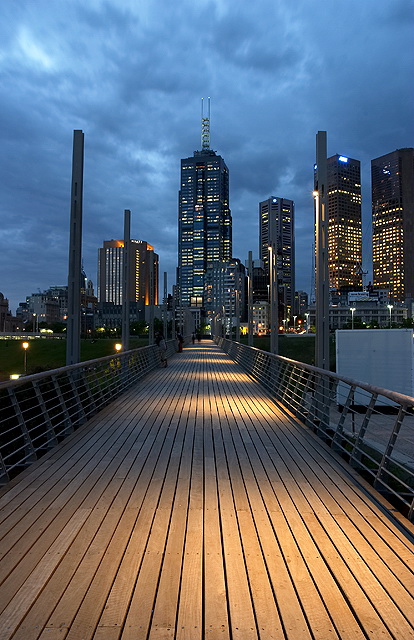
I always score my favorites 9's and then come back pick a few of them and make em 10's and comment this whas supesed to be so too, but since I'm on dialup and the number of entries whas enormous, I didn't get to do it, didn't even finished voting. This is clearely my favorite in the challenge, superbe view, colors, composition and mood, and I know 10 is a good place but I really wish It would ribbon. My congratulations.
I really love this photo. The view is excellent and a pleasure to study. I love the colors and the lighting spots on the walk. I really want a copy of this print so please put it up for sale at the end. I gave it a 9
Very nice image; I think a perspective adjustment would make it better, and maybe a rotate since it looks tilted (may be confounded with the perspective here though). I also tink it would have been nice to use more telephoto. The foreground seems so dominating, yet the buildings are really the dominant force here.
Great light, lines and balance in the composition. I really enjoy the focus of the bridge pushing toward the skyline and then up into the moody sky. The image seems a bit tilted to the right though. (7)
Wonderful clarity and lighting really makes this photo for me. The path and center building are a bit too centered but still a remarkable image. Well done.
I realize there is little you can do about it (well, nothing legal) but the posts on the bridge are taller than the skyscraper and really take away from its grandeur. However, if you have enough zoom and enough room behind you, by increasing the distance to the posts and zooming in, you can reduce their height in relation to the building.






 Add photograph to your favorites
 Add photographer to your favorites


 Photographer found comment helpful.


