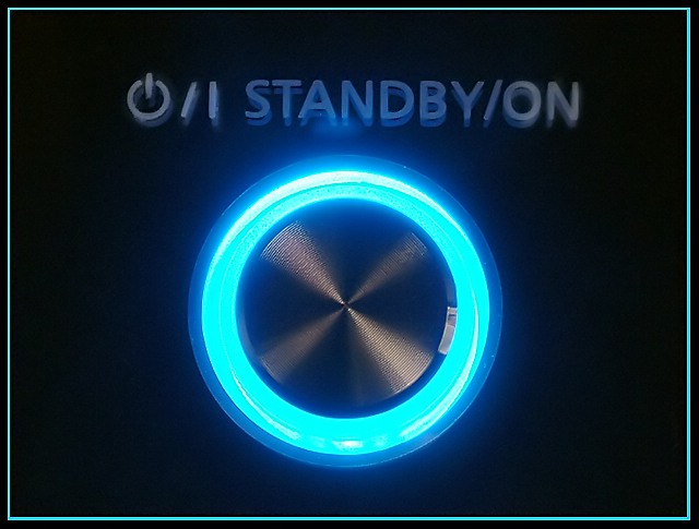
From the thumbnail this looks like a potential top 10. on closer inspection, however, it loses a bit of impact by the out of focus letters. perhaps this was an unavoidable consequence of the device's lighting but looks like you might have used a slightly higher position to eliminate the shadows behind the letters. Also, a pity about the highlight and flare at top of blue ring. A well imagined shot though and these small points are what makes the difference between an 8/9 and a 6/7
I'm a total sucker for neon, so I'm naturally drawn to this one. The detail is impressive, and the concept of shiny metal buttons screams of the challenge. Very well done, good choice... Unusually, the border also actually compliments the image. 10.





 Add photograph to your favorites
 Add photographer to your favorites


 Photographer found comment helpful.
