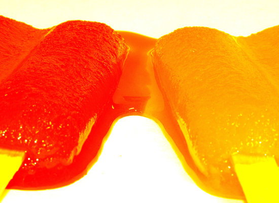
I set up these Popsicles in my kitchen, unfortunately I do not have the greatest lighting, so the background looked a little yellow. I changed the contrast setting a bit to try and help that.
Statistics
Place: 85 out of 141 Avg (all users): 4.8927 Avg (commenters): 5.4667 Avg (participants): 5.0164 Avg (non-participants): 4.8488 Views since voting: 960 Views during voting: 339 Votes: 233 Comments: 16 Favorites: 0
Great colours, but just could do with being sharp across the full length of the lolly because it is quite blurred in the foreground. A smaller appature would have seen you right on that front. Bit of a orange colour cast as I can't remember holding a brightly coloured stick when I was a nipper
i'm thinking two contrasting colours for the popsicles (grape & orange?) might have made it stand out a little more and another background choice (like a shiny black marble surface). the white is just overpowering for me, though it may have been ok if the popsicles were different colours.
This seems a little over-saturated, or something. The front edge looks straight more than melting so the puddle looks frozen which doesn't seen quite right with the melting ice-blocks. I love the idea though and it certainly reminds me of my childhood but for this challenge it might have said more if it were melting on concrete or a floor. That would say more about the emotion of a child dropping their ice block than a studio looking set up, for me anyway. I do like the lighting on it and the texture of the ice-blocks.
Nice color! I wish they were a tad sharper. The white edges are so bright they distract a bit. How about a lone drip of juice in the white space? That would give us another point of interest to ponder.





 Add photograph to your favorites
 Add photographer to your favorites


 Photographer found comment helpful.


