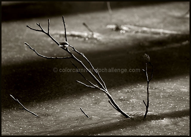
As far as I am concerned, the top left and the base of the branches have been framed in by diagonal shadows. As far as DPC voters are concerned - I'm guessing that it will be judged on one plane.
Sepia is my new favorite color tone :)
POST: My subject is framed in the foreground and the background. Maybe try tilting your head to the left ;)
Statistics
Place: 106 out of 159 Avg (all users): 5.0134 Avg (commenters): 5.5000 Avg (participants): 4.6458 Avg (non-participants): 5.1136 Views since voting: 988 Views during voting: 309 Votes: 224 Comments: 23 Favorites: 1 (view)
Well I see from the OOBIE and Posthumous threads that this was a photo that really touched some people, and for me even if a lot of people did not get it this is so much better than having everyone go "hmmmmmm its OK".
Very clever take on the challenge, and I love the sharpness of the emerging sticks. Really top class B&W conversion as well. Overall an image that will have a lot more long term appeal than many that finished above it in the challenge
I agree with you, I think it was because your framing lines were diagonal, that threw people. Tilt your head, it's obvious! :) I liked the look of this, I thought it was a great study of light and shadow.
Making people think is always a risky occupation. You will no doubt receive a posthumous award. That last sentence is as ambiguous as your photo. Sentenced to ambiguity.
Another top notch photo ive come to expect. I hadnt voted on this one. The lighting is amazing. You have a good eye for seeing something when most of us would just glace over it.
Nice out of the box shot. Too bad Dpc doesn't reward these type of shots with high scores. Your reward should be that its an above average photo. Very nice work. I did see the framing but found the big shadow a bit of a detraction therefore I gave it a 6. In the end its only my humble opinion.
I certainly disagree that you need to see examples.
I think the main reason people didn't see this as having a frame is because the large shadow across the center makes the image look more striped than framed. Still, I like the image, and think it meets the challenge.
Does not meet the definition of framing. I hope that you learn from viewing the entries of your competition
I hope others who see this comment will see that this approach (of doing only what the competition does) is very narrow-minded. I say use the competition for inspiration but don't use it to limit your creativity.
I really like this. Not sure why. I think maybe it's the competing diagonals (branches vs shadows). You have framing in here, albeit non-traditional, that could be too subtle for many. Hope that doesn't hurt your score too much. I've picked this for my top 3...good luck getting there! :) Well done.






 Add photograph to your favorites
 Add photographer to your favorites

 Photographer found comment helpful.


