Nice focus, contrast, and colors. It feels like the top of the image is cut off. I'm not sure if that is because of all the vertical lines or because of the negative space at the bottom. It makes me wonder how this scene would look with a diagonal composition.
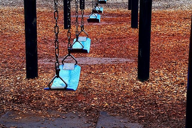
Oh! I really like this one! It's always sad when swings are empty! And the title...wow you sent shivers down my spine! You did a good job creating contrast between the blue swings and the reddish orange bark. However, the fact that the bark in the back of the picture are not colorful is distracting to me. It just makes the image seem fake. But your angle is one to be praised! :] Great job!
Great concept, but I think it could be improved using a different angle. The gap between the 2nd & 3rd seats distracts from the composition. Also, the dark support poles atre distracting. I wonder how this would look in black & white.





 Add photograph to your favorites
 Add photographer to your favorites


