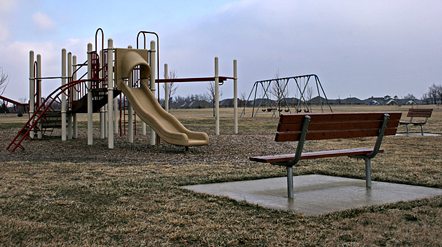
Similar to at least one other entry, but I like this one much better. Colors could use a little bumping up, Those slides are normally a bright yellow. That low contrast may have been intentional, however.
This is a great idea with a great angle but I think that you could have lighted up the image more. It seems dark which makes the image seem less interesting. You also could have upped the contrast to make the image stand out more. But overall good job! :]
Fairly dull colours, an impressive sky with a silhouette would have more impact. Another thing to have tried would be to use a really while angle with the camera on the ground at the base of the climbing frame looking upwards.






 Add photograph to your favorites
 Add photographer to your favorites

 Photographer found comment helpful.


