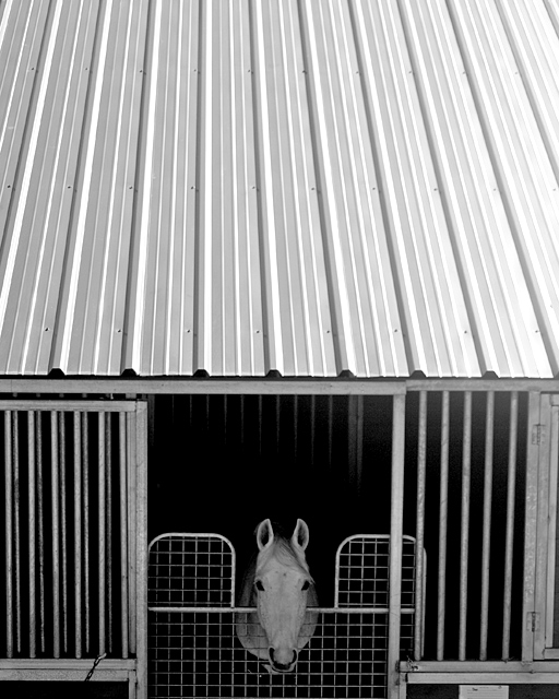
Great to see you entering another challenge and congratulations on the impressive top 30 finish. This was one of my favourite shots in the challenge, as not only did it perfectly fit the challenge description but it did so in a wonderfully unique way. I love the symettry of the image and the wonderful range of tones in the black and white conversion (somehow you have got very black blacks and very white whites, but the shot does not appear harsh and has a gorgeous softness to it that compliments the image completely)
7 - Like this. Any variation in the crop of the roof would still look good (although wonder whether it may have made the image stronger with less roof, but your call of course), my only real 'complaint' is that it needs a nudge up on the right... unless it is intentionally tilted a little.
This is a cute photo. The centered subject works fine here. I do think you've included too much of the roof IMO. As for the challenge theme, I'm not sure that you've really used foreground or background elements?







 Add photograph to your favorites
 Add photographer to your favorites

 Photographer found comment helpful.


