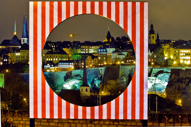
What a stark contrast between the beautiful lighting and muted tones of the city scape and harsh white & red "frame" that overpowers the picture. IMO, not a pleasant combination.
Yes, it frames the scene nicely, but what is it? Actually, the scene is nice, but the framing element looks totally out of place. I'm afraid it doesn't work for me.
Watch your cropping, I can see white areas at the corners where you straightened the image.







 Add photograph to your favorites
 Add photographer to your favorites


