I have wanted to submit an Image of the big-I since I joined this site...so here we go.
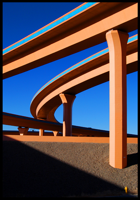
the Sun was vibrant this day which helped to bring out the wonderful colors of Interchange.
This is the junction where I-25 and I-40 cross in Albuquerque New Mexico.
Was a bit of luck to find something as simple as a fire Hydrant to give scale to this work of art.
a little perspective inhancement and the saturation kicked up a tad and this is what we came up with. I took about twenty different shots, I liked this one best.
Statistics
Place: 2 out of 126 Avg (all users): 6.9871 Avg (commenters): 8.1935 Avg (participants): 6.9375 Avg (non-participants): 7.0400 Views since voting: 5175 Votes: 155 Comments: 48 Favorites: 13 (view)
Composition
The composition is impressive. You included the fire hydrant for perspective, you have diagonal lines disappearing into one of the corners of the image and you captured the architectureal beauty and magnificence of this subject against a graduated backdrop of ever darkening sky. Artistic of you to see something like this and then be able to capture it to share with others. Because this was based on the Advanced Editing rules, however, I would like to see just a couple of changes to your composition. The large vertical column just above the fire hydrant has what appears to be a white sign on it (in the shaded area). I think it would enhance the photo to clone that out. Likewise under one of the spans of highway that runs almost horizontal you should be able to see what appears to be a traffic sign. I think the picture would benefit from having that cloned out as well. Those two things are minor nits and easily overlooked on first viewing of the photo though.
Color
The colors in this shot were kept to a minimum (probably by the designers of the interstate) but it works well for you because it allows the grace of the design to speak more powerfully. The organic orange hue seems to work well whether it is cast in full shade, sidelit or in direct sunlight. The yellow/orange of the hydrant is starkly lit against the shaded cement. The range of blue in the sky is a beautiful backdrop against which the scene can be set. The high-octane blue along the side of the interstate walls works in contrast to the muted orange and the darker blue in the upper left corner. The image contains few colors but they all receive ample space in the photo so that they help to create a beautiful scene. Rather than having blobs of color, the extended lines help reinforce the graceful concepts that went into this design.
Focus
You have ample depth of field here with your aperture of 9.0. I'm sure the amount of ambient light you had to work with helped you and I think that any smaller aperture would not have worked (see Lighting).
Lighting
My argument against a smaller aperture is that I think it may have resulted in shadows that were too dark to create the 3-tone effect that some of the roadway has; I think it would have tended to generate areas that were "in light" versus areas that were "shaded". With your capture you have produced 3 distinct ranges out of one color. The whole interstate seems to thrive off the bright orange hue on its surface but you have enhanced that by going when this section was in direct sunlight and you have further deepened the color by shooting at f/9 which allowed you to get brightly lit sections of the road as well as mildly lit ares and much deeper shadows. The shadow running down to the fire hydrant is also timed almost perfectly; it leads the eye down the photo to the hydrant.
Overall
This photo is a very strong shot given your title. You truly nailed what it looks like you were aiming for. It is abstract art from a view of an interstate roadway. Congrats to you for seeing it and noticing the beauty and balance inherent in this view and even more for being able to capture it and share with us. It is deserving of an award. This capture the essence of the design that others labored to produce; to me you got exactly what a photographer should look for: a replica that inspires its viewers in a similar manner to how the original view must have inspired you.
Congratulations..well deserved ribbon.
Never noticed the hydrant originally and wondered why you hadn`t cropped the bottom slightly..which only goes to prove that I should have been looking harder.
Congratualtion on the ribbon!
I'm the one that noticed about the color which looks not really natural, BUT i'm not the one who gave you "1", of cource not... :D
I thought it was a great shot. Then I saw the hydrant and actually said "wow!" out loud. It really gives you a great idea of how big the structure is. I'm glad you left the hydrant in! Congrats!
This Interchange is indeed painted with blue and beige. I have a feeling the one person that was generous with the "one"..."1" I recieved may have felt I colored this in.....gotta laugh:)....I have the honor of having the only "one" in the top ten:)
thanks again to all that took the time to vote and comment.
THis is really great...just two nits....lossing the hydrant and extend the shadow in the bottom right corner and, IMO, it would absolutely perfect! WOW! 10 despite the nits cause when I scroll up (or is it downLOL) I don't see them.
Very effective composition and colours and a wonderful interepretation of the challenge. Small points - if you have photo-editing software you could have got rid of vehicles (?) protruding above parapets and also fire hydrant (?) in lower right (or croped a bit higher). Excellent image overall.
Nearly a WOW photo, I love the form of the structure and the colours are outstanding, but...the object in the bottom right just spoils the overall impact a little. Nevertheless I am certain you will be placed quite high.
Man, too bad there is a shadow....this is a really strong image. But, I can't help but feel like the image is cut off at an angle. I tried to view it as a part of the composition, but my eye just gets pulled right to it. 7
Oh... I really love this one. It's one of my favorites in this challenge. I love the colours and how you incorporated the design of the structure into the design of the photo with good composition. GOod luck! This is pitch perfect!
Great abstract. Hope this is not voted down much for being "unphotographic". To complete the surrealism of the composition I would have cloned out the fire hydrant, the two light spots to the left of the near upright and the light rectangle in the shadow at the bottom of the near upright.





 Interstate Abstract
 Add photograph to your favorites
 Add photographer to your favorites

 Photographer found comment helpful.


