Author Thread Comments Made During the Challenge
Post actions
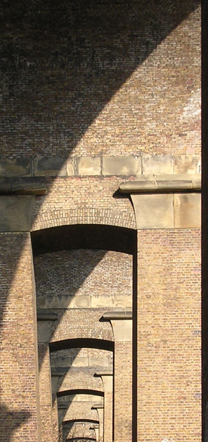
interesting angles and shadows - if it weren't for the shadow at the bottom left this would be a top choice
Post actions
The black line on the right hand side should have been cropped out. I almost wish this image was cropped to be symmetric except for the shadows cutting diagonally from upper right to bottom left
Post actions
good shot but the thick black edge is distracting.
Post actions
I really like this, but would have liked to seen more of the arch from the bottom on up.
Post actions
Beautiful arches. I'm not completely crazy about the shadow in the bottom left, the line on the far right or the blatant skinny crop of the image, but the overall effect is very nice.
Post actions
Beautiful perspective and shadows. 9
Post actions
nice time of day... too bad you have a lower shadow. what is that? Also, bottom crop is too tight. Go further out and zoom in to get this one
Post actions
What's with that black line on the right? It's distracting and looks like part of the frame. Try cropping it out and placing a frame all around about the same width.
Post actions
Creative take on the challenge nice shot
Post actions
interesting photo - would like to have seen more arch...
Post actions
Good seeing here and you chose your lighting carefully for effective shadows. Well done.
Post actions
Would've been a real 'hum-dinger', but the top of that bush ruined this photo for me.
Post actions
An interesting pattern - would look better in B/W though
Post actions
i don't like the dark band on the right. nice repetition.






 Add photograph to your favorites
 Add photographer to your favorites


 Photographer found comment helpful.


