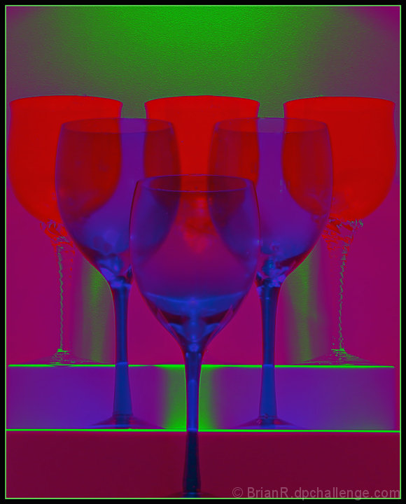
This will be overboard as far as a lot of photographers will think, but as we are celebrating 6 Years of photography with DPC I went with the colors that put together all the great images that come onto the front page.
The image is the overexposed file of bracket shooting and after some Spot healing, Levels RGB, & Channel Mixing came up with this abstract image and said ok go for it.
NI
Brightness/Contrast
USM
Border.
Expectation— 4.6 but that is normal at the moment.
Exceeded my expectatons, but when you are on Morphine Narcotics (prescribed) it is amazing the things you do.
Statistics
Place: 111 out of 134 Avg (all users): 4.8298 Avg (commenters): 4.6667 Avg (participants): 4.5263 Avg (non-participants): 4.9618 Views since voting: 928 Views during voting: 292 Votes: 188 Comments: 11 Favorites: 0
Brian, I really like this image. I gave it a 7 during voting. I thought you had used a gradient map adjustment layer to get the effect. I often play with that layer myself. It's interesting to read about your processing. At any rate, no matter how you did it, I like the product. It would be great in very large format on a wall in a modern loft.
I think you're going to get a lot of 1's for this. I'm not sure if anyone will go to the trouble to comment so i'll see what I can do. The first thing struck me was that it looked like your monitor or camera screwed up the colours. My second thought was that this was terrible, and the main reason being that you had a nice pic, but ruined it with the colouring method. I think it would have worked with the glasses filled with red, green or blue liquid and then gone from there. As it is, it's muddy, badly defined and it's hard to see the shapes within the frame. I'm sure you had an idea in mind when you took the shot, but i'm not sure if this was it. But hey, i didn't even enter!





 Add photograph to your favorites
 Add photographer to your favorites

 Photographer found comment helpful.


