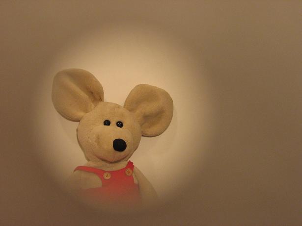
The compsotion seems to be a bit stange for this type of shot and I feel that centering this might have helped. The color if the vignette is a bit to close to the color of the mouse and there is no real contrast, maybe a different color could have meade teh mouse pop.
Some low contrast and so-so lighting. I do think this would work if you punched up the colors and contrast a bit.
Your file size is only 17k. JPEG compression is surely the culprit for a lot of the lack of clarity. It's highly visible around his ears. For challenges, always save your files with the least amount of compression that comes in under the file size limit. (150k for this challenge)
Cute mouse. I think having the mouse further away from your background would help give the shot a bit more feeling of depth. Also, if whatever you used to make the circle was darker, that could also help add to the contrast.






 Add photograph to your favorites
 Add photographer to your favorites

 Photographer found comment helpful.


