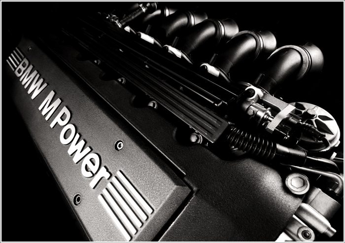
Technicals: I think you did well here. It's almost a 6 which almost always indicates that the technicals were well done. You chose a nice perspective to show off both the wording and give depth to the engine. The lighting is well done as well as the B&W conversion. One issue, which you cannot help, is the distortion the 10-22 lens gave you. I can see it mainly at the lower right. Again, though, what can you do about that? The whites on the front stripes are just a bit overdone and I may have been tempted to try to reveal a bit more in the central shadows as the center of the picture is pretty dark (thus not giving us something to look at except on the periphery of the canvas).
Strong commercial image! This has the quality and style of an image that would be commissionedd by BMW for an M-series brochure.
It's not only the mono, which appears much more effective than colour would, but it is the subtle but even use of light. the intakes all get the same shape because the light is spot on. The cam cover has that lovely receeding tone that make the engine look like it goes on forever.
Less is often mpre and this image demonstrates that perrfectly





 Add photograph to your favorites
 Add photographer to your favorites

 Photographer found comment helpful.


