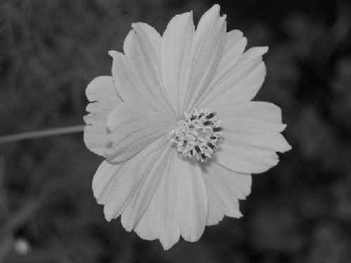
1) Flowers look better in color, unless there are curves and tones in them that favor Black and White.
2) It looks a little soft and/or pixelated, maybe a result of resizing or perhaps camera limitations.
3) Composition is dead center. Look around a bit for the Rule of Thirds and immediately see an improvement in compositional skills.
I wonder how this might look with a little bit more contrast? Also, I would suggest trying out a different composition. Usually a centered composition isn't very exciting. Try placing the subject off to one side, using the rule of thirds. Hope this helps! ;)
I think color may have been better and either using the rule of thirds so its not right in the center or cropped the right and left so the flower filled the frame. I do like the fine detail you can see on the petals.
Converison to B&W kills this image. Flowers are meant to be vibrant and colourful which hard to do in B&W. Need to maximize the image size as well. Sorry. Good Luck. 2.
I gotta be honest, i'm not sure why you would take something as naturally beautiful as a flower and make it black and white - doesn't make sense to me!! Technically wise i'm not overly keen on the centered composition and is too tightly cropped at the top and bottom.





 Add photograph to your favorites
 Add photographer to your favorites

 Photographer found comment helpful.


