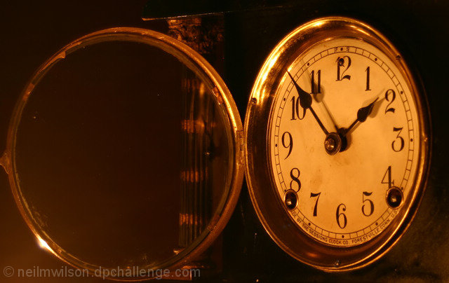
Reflections off of metal are always hard to deal with. Your picture looks somewhat distorted in that the glass cover does not look round. Probably the angle of the shot but the clock face does look round and they don't seem to match. Also, I would have cropped the picture more tightly on the right side as the picture appears uneven.
This almost looks like an illusion as although my brain is telling me that they are both facing toward me my eyes are thinking they are both facing/opening away from me too. Very trippy! As for the image itself, I like it. The yellow cast works well to age up the image and I like the 'dirty' clock face. Looking at it more it looks like a clock instead of my initial thought of a pocketwatch, which explains the 'column' at the back that seemed a little distracting.




 Add photograph to your favorites
 Add photographer to your favorites


 Photographer found comment helpful.


