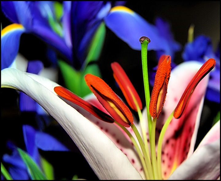
Well, I did better than last years BEST OF but I did not do as well as I hoped in this years. When I sorted trough some of my shots this one popped out. I considered these aspects that prompted me to not look further. First of all the complimentary colors. Second the diagonal and rule of thirds. Third the clarity and detail especially in the stamens, incidentally no one commented on the title so I guess it was not so clever or something, and 4th it is not a common floral type of shot. This also has DOF and texture. So I felt I captured some good technical merits on this one but I pumped up the brightness and clarity to make it pop and stand out but... apparently too much. So again, a very good learning experience as to what the masses like and what I need to pay more attention to on my learning curve.
Thank you to Ivory for giving me a 10, what an honor from an accomplished photog on this site.
And thank you to all of the commenters for giving me a hand on what I did right and what I need to improve on.
Statistics
Place: 253 out of 484 Avg (all users): 5.7819 Avg (commenters): 6.4167 Avg (participants): 5.7384 Avg (non-participants): 5.8873 Views since voting: 875 Views during voting: 350 Votes: 243 Comments: 15 Favorites: 1 (view)
WOW!! just scored a bunch of B&W's and then BAM! the clarity and color of this image pops me in the eyes...very pretty composition and clarity of colors
An excellent use of color! This wouldn't be half the picture it is without all that lovely blue/purple/green in the background (so don't let anyone tell you it's too "busy".)






 Add photograph to your favorites
 Add photographer to your favorites


 Photographer found comment helpful.


