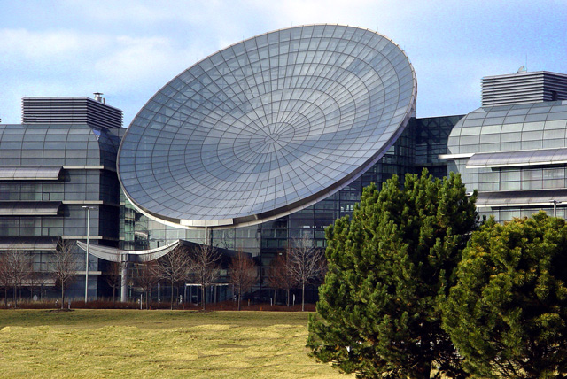
Lucent Technologies' World Headquarters.
Very slight color correction and crop. Some foreground clean up with the clone tool. Unsharpened and then saved for web.
Statistics
Place: 42 out of 126 Avg (all users): 5.8808 Avg (commenters): 6.3750 Avg (participants): 5.6750 Avg (non-participants): 6.1127 Views since voting: 1206 Votes: 151 Comments: 20 Favorites: 0
Very nice image, has an instant visual impact and really fits the challenge well. It has a sort of surreal feel to it, almost like I'm looking at a rendition of some 'building of the future' ad. That said, let's take a closer look at a few things.
Color: I absolutely love the richness of color in the photo, the blues are very cool and help give a tech/science feel that is highly supported by the general shape and design of the building. It really contrasts well with the yellowy grass in the front too. Nice contrast there. I think the green of the trees could've worked well color-wise but their position really draws away from the positive they could bring.
Which leads us to the next point: Composition - the composition for the most part is wonderful. The natural lines, angles and curves are well represented by the photo, well centered and shot, however.. those trees really do kill it. I find myself wondering how the building would look without them in the way. Particularly since you can see a hint of something behind the trees. It may not have been feasible to compose the image the way you wanted without getting the trees in the shot but if that option is available I'd suggest a reshoot just to see the difference.
Lighting: The lighting is excellent. Obviously natural light was used which can be tricky, but there isn't any distracting glare or oddly lit areas which is a nice achievement. With all of the glass and metal, the lighting could have been (might have been?) a nightmare, but it was handled very well. Kudos.
Focus: The focus is perfect. It has a nice crispness to it which plays off the rigidity of the lines and angles shown, yet it isn't overly sharpened which would have made the nice curves of the dish too harsh and lost some of the surreal quality in the clouds.
I do notice a bit of the pixelation others mentioned in the top right corner, which isn't too bad but does detract from the photo.
All in all it is a marvelous photograph and well suited for the challenge. Nearly all aspects look to be thought out and manifested in the best way possible with my only real detractant being the trees in the foreground. Well done!
What a cool design for a building! Nice photo. Might have been better with a bit less bush in the foreground. I want a dish like that for the front of my house.
That is amazing architecture. Too bad those green trees are in the way. I like the feel of the dead trees in front of the building next to the cold glass & grey of the building. :) Where is this?
Way funky building. Don't you just hate it when bushes just run out of nowhere and ruin a shot? LOL! Excellent choice of subject matter, but those bright green trees really take away from this shot. The sky on the right is also highly pixelated.
This pic looks odd to me... the trees and grass especially look strange. Maybe your camera is low res or something? The structure itself is really interesting however.
Great Naperville shot. Not an easy subject to capture. Not sure if I like the trees in the foreground - they do offer perspective and framing but their chunky appearance is somehow out of place with the sleek design of the main structure. As is, nicely done.
Never seen this building before, VERY COOL! I like what you have captured, all except for the trees in the foreground. You got me on visual impact though! 7
The lighting, the color, the content, the composition... this is just one super fine image. The only improvement would be to apply noise reduction to the sky. Despite the sky noise this should be a top 10 finisher and in the running for a ribbon.






 Add photograph to your favorites
 Add photographer to your favorites


 Photographer found comment helpful.


