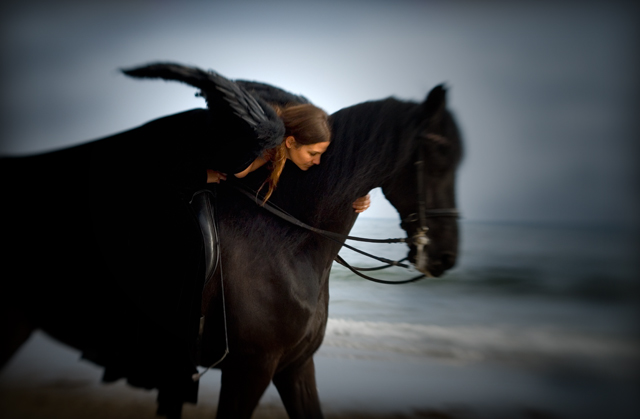
Just don't know where I'm at with this one. I've been back to look at it several times before I comment. I like the overall softness with just the area of her head in focus, and the burned in corners, but really have trouble with the "black" aspect of it. I would like to have seen the entire horse in the image, or alternatively, a much closer crop on her head/face and the horse's head.
This seems to convey to me the concept of black/evil in the world, and I am not comfortable with that. Would I have been OK with a white horse and white angel? Yes, most likely I would have been. Is that ridiculous? Well, maybe to someone else, but that's how I feel. (I did not vote it "down" because of how it comes across to me, but rather on it's effectiveness as an image (in my opinion), and gave it a 7).
The burning around the outside is negatively impacting the outcome IMO. Lighting is good and I like the composition. I would have liked to seen the entire image processed with the softness you have around the subjects face. Good Luck. 5.
I really wish you entered this at 720 pixels
Stunning, unique image
love the vignette and the overall edit
the angel wings are fantastic
just wish it was bigger 8





 Add photograph to your favorites
 Add photographer to your favorites

 Photographer found comment helpful.


