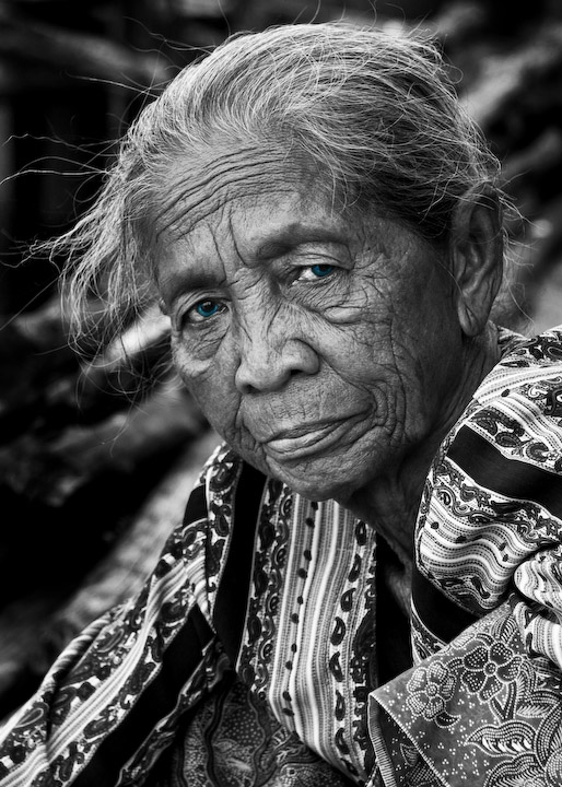
The one drawback to me unforetunately is the Blue Eyes. You have captured a beautiful image and if it was her eyes you wanted to capture then you should have left it in colour and tweaked the blues. I personally would have done the B&W and tried to punch up the contrast a little more. Good Luck. 7.
Sorry, I don't like the eyes. Appropriate for the title, but I would have liked it better just B&W. Other than the blue, it is a very nice, sharp and interesting portrait.
Lovely capture, the expression is really great. IMO though the blue eyes just don't fit the picture, I love the b&W and the composition, but they seem to throw the shot off, because its such a powerful shot. Nice work.
I think the texture of age and the eye contact was more than enough to attract. The almost over-lookable desaturation to show off the eye colour did not work for me. But I will grade your photo not on that processing which failed for me but the overall pose and model which seem good. 7.
wow! this is an extraordinary subject, supremely well seen and shot, but the blue eyes just really take me out of this image--such a beautiful b/w portrait, but the blue eyes just start screaming manipulation at me. Take them back to grayscale, and this image will SING, not scream. (but I am an old school b/w film guy who never scored a portrait this wonderful, so it could be old codger jealousy here, so factor that in, too)
Oh! I'm sure I'm not the first person to express that the blue color in the eyes takes something away from this wonderful protrait of a fantastically interesting woman. Wonderful in b&w. Well composed. Great textures and expression. 7






 Add photograph to your favorites
 Add photographer to your favorites


 Photographer found comment helpful.


