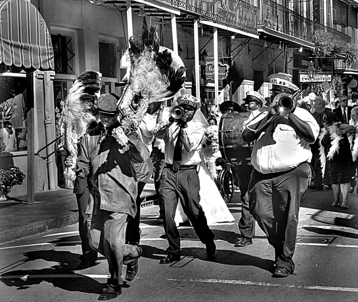
The composition is a little bewildering here - although the different contrasts and tones are nice, there is so much that the image has become confusing, and the viewer's eye doesn't quite know where to rest. Otherwise this is nice. :)
I've looked at this a few times now and like it more than I first did. The processing works for me here and gives it a historic feel. Curious to see if others liked it as well. Nice contrast and detail Good Luck. 7.
Cool shot that looks good in black and white. New Orleans makes me think of "colourful", though, and I can't help but wonder what this looked like with the colourful feathers and outfits. Eliminating colour out of a picture reduces it to its tones only, so one has to be even more careful about composition, contrast, etc. I think this image is a bit too busy, and makes it difficult to take it all in. That can work sometimes, as it requires the viewer to analyze everything, but other times the viewer will just go on to the next image.
I might suggest a tighter crop on what you think is the most interesting aspect of the image, leaving the viewer to guess more as to what the rest of the event was all about.
I like the idea, but the HDR (if that is what has made the tones this way) and the bride's dress in the background are a little distracting for me. I like the big guy on the right :-) and I know I would've loved to be there!
I think this photo has a lot of potential, but it looks overprocessed to me. The man in front has some black stuff on his face? Im not sure what that is, but his suit and hat look fake as well. I like the b&w conversion a lot though, just a little less post processing.





 Add photograph to your favorites
 Add photographer to your favorites


 Photographer found comment helpful.


