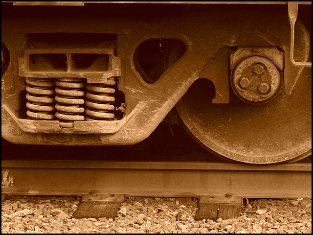
Could probably do with a little more contrast and/or sharpening but the composition is good, and the sepia tone adds to the age of the design. Good shot.
Nicely done the composition is good, sepia works well. The crop could have been a touch lower from the top to take out that thin strip along the top. It really pulls my eye away from the rest of what is a really nice shot.
OK. I like the sepia (if that's what you were going for), although I got slammed on my last sepia entry because it seemed to be a different color on everyone's monitor (some said it was green, some said it was yellow...) However, I think the image is a little flat somehow and the fact that the track is slightly crooked irks me...
interesting. I would like to se it a touch darker... so the blacks are black. good use of sepia.. i like the DOF... perhaps the top edge is a little to 'almost in line' with that line on the train.






 Add photograph to your favorites
 Add photographer to your favorites


 Photographer found comment helpful.


